Douglas Fraser

2012

Walls & Stairs

OCTOBER 18, 2012

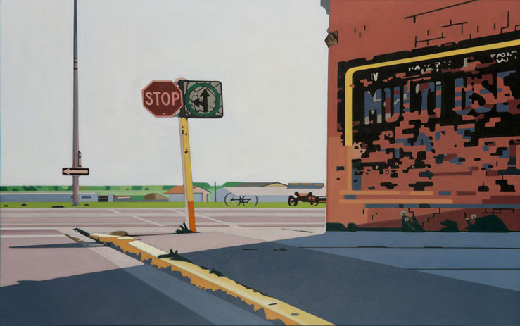
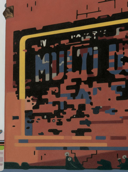
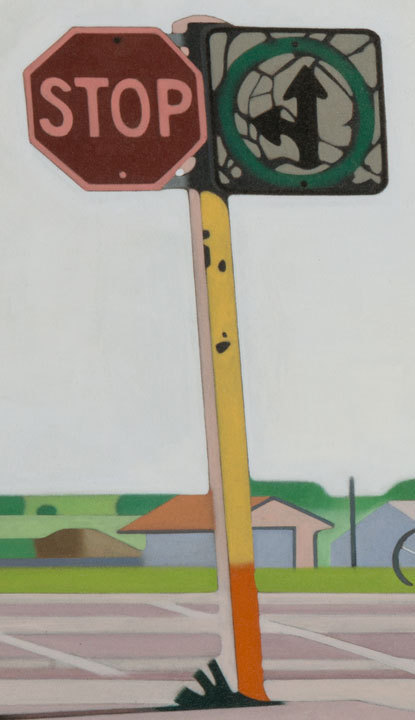
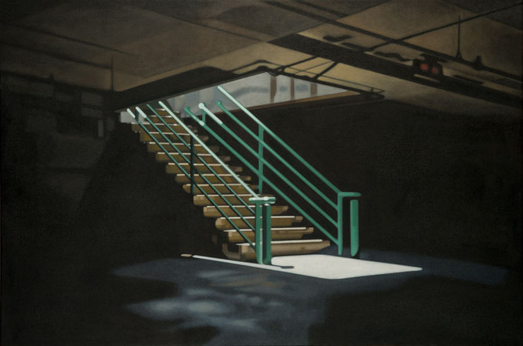
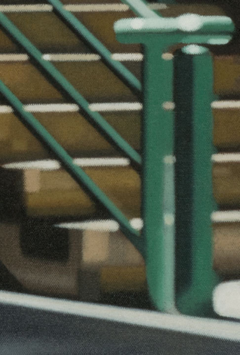
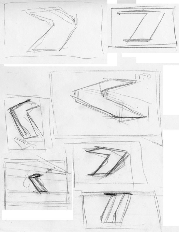
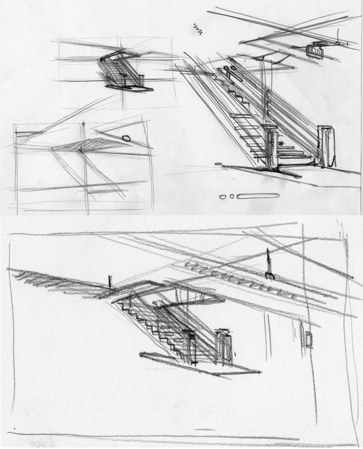
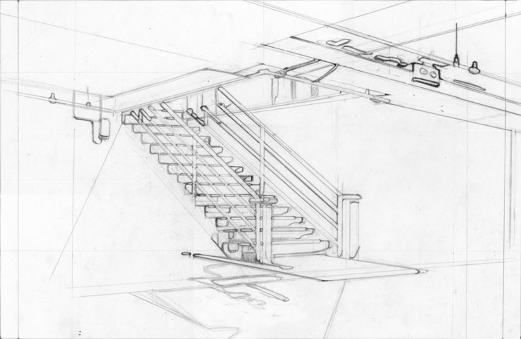
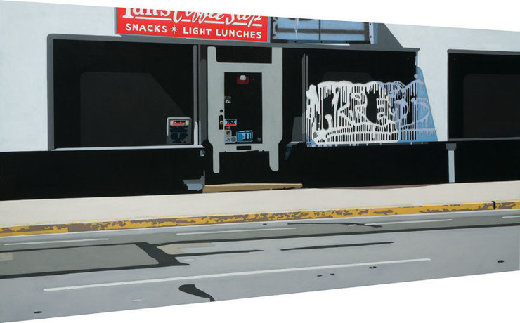
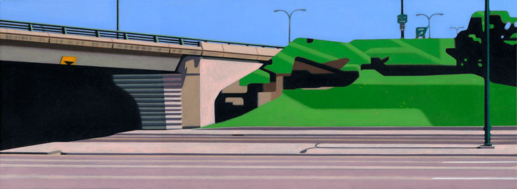
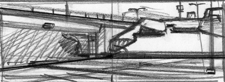
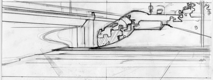
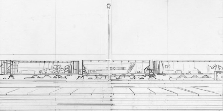
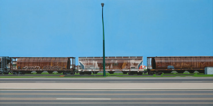
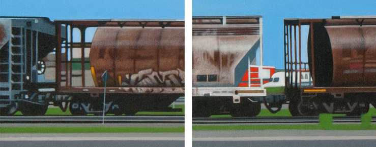
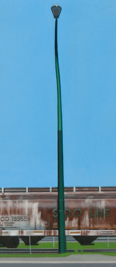
After scraping and heat gunning the old paint from some of our old house last summer, and then prepping, and painting, then going on a road trip to help in painting some rooms at my in-law's, I've noticed a theme in my life; walls, walls, and some stairs. In my studio I've been painting with doing another gallery show in mind. The feedback from the gallery has been positive, but the request for larger scale work has been made several times. Working with different scales, and surfaces. Some of the surfaces have been light weight finely woven cotton canvas, contrasted with a heavier duck for larger canvas, as well I still enjoy the panel boxes which I construct. As the scale goes larger the panel paintings seem to run up against the issue of weight, and being somewhat cumbersome. I've done some painting on linen as well. I do enjoy the attributes of each. As the scale has increased, I've experienced a new physicality in my painting(not to mention the house painting). It's demanded a different approach in how I literally must stand while painting. I understand it's good for digestion, ha-ha. It's possible to sit for intervals while working on appropriate sections. Well the studio, and house painting has me thinking of buying an old used panel van. It'll help transport materials as well as larger paintings.

Multi Use - oils on panel, 17.5 by 28 inches

Multi Use - detail.1

Multi Use - detail.2

Stairs - oils on canvas, 36 by 54 inches

Stairs - detail.1

Stairs - early scribbles

Stairs - early rough sketches

Stairs - final base sketch

Wall Street Gasser

JUNE 20, 2012

More car culture. Orlie Kraus, art director at the Wall Street Journal drove an assignment proposal by. I had fun kicking around ideas of a future natural gas auto world. Orlie & I discussed the article on the phone, and we both threw out ideas. The visual steered around to an American Muscle car with big blue natural gas flames coming out of the back. The car would be frackin' fast I suppose. Probably not the most PC thing. As I worked on the sketches & finish, visions of youthful passions of Hot Wheels, Hot Rod magazine, Car Craft, …….. kept me bolting together my finish. After polishing the details I sent her off for the show. Hot Wheels & the Wall Street Journal hmm…there's a mix.


Preliminary sketches

Development & execution of final art in vector.

Finish fired up.

polish those rims! - dete. - vector art

Usage on web & print, done & run.

Subtext

JUNE 7, 2012

Finished an assignment for a magazine I was not familiar with until recently. The magazine is Associations Now, which is a resource, " of learning, knowledge and future-oriented research for the association and nonprofit profession, and provides resources, education, ideas and advocacy to enhance the power and performance of the association and nonprofit community". Okay, That's from their website. The art director, Beth Lower had come forward with a visual in mind. That visual suggestion was as follows, "At our editorial meeting we discussed a simple idea of water with a periscope poking out—and maybe the subtle image of the submarine under the water.  Please let me know what you think". I liked the idea having dealt with a sub-like craft in previous assignment some years ago. I had presented the idea that I wanted to work in vector software for the assignment. Beth was comfortable with my wanting to work in vector. I was emailed the article, and read it. Having read the article it was my opinion that Beth's visual was as good or better than any I would offer. After developing my sketches, a couple seemed to be leaning in another direction in my minds eye. Focusing in on the subject early has the benefit of really nailing down the design, and look of the final art. Beth & I also discussed what in my illustration work she thought stood out in her mind. She was leaning toward my traditional work in tone and feel. So it was agreed I would work in my oil based approach. By getting the focus on the subject early, and a sketch approved quickly, there was the time I desired to do the execution I wanted. My concern when working in oils is that changes or tweaks after the finish is done, is like taking a hammer to a freshly constructed surface. No command-Z keystrokes, or backed-up versions to quickly fix. In the closing, I quite enjoyed the process, and subject of this assignment as no mines were encountered.


Sketches - three directions with a variation on one.

Illustration art for an article titled; Hiring from the Outside. Oils on paper. Beth Lower, Art Director ASAE: The Center for Association Leadership Associations Now Magazine

Workin' Joe

MAY 21, 2012

Last week Joe Heroun of The New Republic emailed, and asking if I was up for a cover assignment. Working with Joe has been a great pleasure of mine. He requested a vector execution of subject matter that I've traditionally handled with oils. That subject being the worker, or blue collar person. Strangely I've not done too many blue collars on workers, hmmm…. Well, anyhow, I've enjoyed Joe's direction in past as it's gotten me delving into thoughts(visual ideas) I've wanted to pursue. The cover of the issue is the pivotal battle for the state of Ohio between the Republicans & Democrats. Now elephants & mules are staples of the editorial genre, so I focused on the opportunity to push the graphic vector nature of the medium per Joe's request for my vector work. Joe & I ended up agreeing on going with a white background which contributes to the clean look of the cover. In executing the cover I went two directions for my influences, one being back to my typography classes, and the interaction between letter forms(pre-software). The other direction was forward with influence from my recent gallery work done in paint, while dealing with a subject I'd worked with in past. In the final, Joe & I created a cover I'm pleased with. As an illustrator I am still respectfully of the printed article being the work of art. It's the cover of the current issue, thanks Joe Heroun.

One of three sketches submitted, and the one picked.

Illustration sans type - Battle for the Workin' Joe's vote.

Workin' Joe detail

Shape & Size

MARCH 4, 2012

In one of my recent paintings I wanted to capture a feeling of visual perspective, and explore the shape of object/art. I built a cradle box with a tapered shape that echoed the perspective in the visual subject. The edges of the top and bottom were from the subject as I saw it from across the street. The shape also was interesting to deal with, and a departure from the squares & rectangles I've been working with. I worked with elements in the subject that struck me such as the white graffiti on the dark galss. The details in the subject reminded me of the graphic elements I'd so enjoyed as a kid building model kits. Yes, I did build a few of my glue-thumb-printed masterpieces in my youth. Exploring the details, and interpreting the shapes furthered my awarness of the dialogue between them. The subject for me is influenced by painters like Edward Hopper, and the shapes by painters in the geometric abstraction spectrum.

Diner - oils on panel, approximately 36 by 22 inches.

Diner - detail

The following painting was subject I gathered several years ago, but always stayed in my mind. I photographed the subject on a hot day. The pavement had a bleached quality. The painting was again on a cradle box I made. The smaller size felt appropriate, and I wanted the scale of the object to be more intimate when viewed. It's a common urban subject, but by making the painting smaller, I felt it drew me in.

Under Three - oils on panel, 9 x 25 inches

Under Three - early thumbnail sketch

Under Three - 2nd gen. skt.

Under Three - detail

Drawing Time

FEBRUARY 6, 2012
In for repairs - back of local motorcycle shop. Oils on paper.

Figure drawing drop in. Yes, she did have a couple of band aids on her cheek.

Figure drawing drop in session.

In my own work my sketches, or drawing ends up gone. Wallpapered over with oil paint. I've had a passion for the idea of edges , whether soft or hard in painting. The purity of drawing is something lately I've wanted to feel again. 

Moving Up

JANUARY 19, 2012

Well one of my oldest illustration clients are doing a big move. Rothman’s Men’s Clothing, which has anchored the northeast corner of Manhattan’s Union Square for 25 years, is moving to a larger space a block away on Park Avenue and 18th Street. The new space, at 222 Park Avenue South. Rothman’s was founded in 1926 by Harry Rothman. Ken and Jim Giddon, his grandchildren, took over in 1986. Rothman’s also operates a location in Scarsdale, NY. I've been working with Ken Giddon at Rothmans for roughly fifteen years.


Rothmans NYC - Moving - oils on paper

Rothmans NYC - Climb - oils on paper

permalink | comment
Topical: Advertising  

Rail

JANUARY 2, 2012

My painting Rail along with another of my recent pieces, will be in a group show opening on January. In this piece, I'm embracing the horizontal nature of the scene, and subtle levels of distortion. It's also influenced by a Kenneth Noland piece I'd seen last summer. I wanted to express the stark horizontal bands, and lines of the foreground. Also the subtle tones of the grain cars with faceted breaks between them divides the foreground from the large blue of the prairie sky. The light pole had a mild waver to it. Which gave it an organic nature much like the bright green grass around the tracks. I do miss the summer heat during these short days of winter.

2nd generation pencil

Rail - oils on panel, 36 x 18 inches.

Rail.details.1

Rail.dete.3