Douglas Fraser

Editorial

Columbia Blue

SEPTEMBER 29, 2013

Spent the better part of this September travelling. Just got back into my studio. I looked online to see if an assignment I did a couple of months ago ran. Happy to see it did, seems to have just come out. It's an illustration for the Columbia Law School magazine. The article is about corporate law on the international stage. Art Director was John Goryl at B&G Design Studios. John & I approached the subject fairly directly. I executed the image with vector software.

permalink | comment
Topical: Editorial  

Progressing Back

MARCH 24, 2011

This month's April cover is about the struggles of unionized workers. It's interesting that at the beginning of the twenty-first century, it feels like the nineteenth. The very upper levels of American society seem set on draining every last drop out of the country. It's the teachers, firefighters, police, and other unionized labor that are the bones of a civil society which are now again under attack. As their voices are stripped away, tax breaks for the upper incomes over $200,000, are renewed. The common good of a community seems too much of an expanse for the wealthy to contribute to on a proportional basis. It's playing out in the state capitals across the USA. The cover story is about the events in Wisconsin.

April Cover art - Art Director; Nick Jehlen

I've worked with Nick Jehlen at the The Progressive a number of times over the years. Quite often regarding the subject of workers, and the struggles of laborers.

For The Progressive's Hidden History calender. First United Auto Workers contract 1937, sit down strike. Art Director; Nick Jehlen.
1932 unemployed march on grocery stores in Toledo Ohio. For The Progressives Hidden History calender. Art Director; Nick Jehlen.

Another Wisconsin struggle, as Workers fight to keep their town alive. Art Director; Nick Jehlen.

permalink | comment
Topical: Editorial  

Less Than Half

FEBRUARY 22, 2011

Spots, icons, ding bats, secondaries, less than half a page or smaller, while working on smaller assignments I've heard them called many things. The do present their own set of unique demands, and are usually swimming in type. Here's some of my recent efforts. The illustrations below printed less than half a page;

For Popular Science magazine. Protecting your smart phone from viruses. Art director; Matt Cokeley. Oils on paper.

For Motor Trend magazine. Politics in the automobile industry. Art director; Andy Foster. Vector artwork

For Motor Trend magazine. Viruses in a car computer systems. Art director; Darren Scott. Vector artwork.


Above - Icons for article about jobs with a future in Germany. For the magazine; Wirtschafts Woche, art director; Holger Windfuhr. Vector - artwork

permalink | comment
Topical: Editorial  

Breaks

FEBRUARY 16, 2011

A subject I dealt with before leaving for a winter break from work, was somewhat timely. The subject of violence in the workplace. The art director for the assignment was the every open, and insightful, Roy Comiskey. The signs for possible violent events seem to be there, yet can happen without warning. I can say that the subject was interesting, and as someone who works alone, it's a curiousity. An employer it would seem has to maintain a vigilence. I wanted a darker tone, offset by a more banal setting. The cubicles I've seen in office spaces always leave me with an odd feeling. I enjoyed the subject manner as it delves into the struggles of contemporary life & work. Working with Roy is a pleasure. My winter break is over, and it's back to it in a none violent manner.


In my pencil sketches I'd developed a split panel approach to crop in on some telltale signs.
Feedback from Roy & the editor had me developing sketch #1 further. The finish is a simpler split.

Illustration into Roy's layout for Security Management magazine

permalink | comment
Topical: Editorial  

Dog

DECEMBER 3, 2010

Dog is a noun, and can be a descriptor. Recently I did an illustration of a dog. It's a subject I've dealt with over the years. It's funny I've always had a picture in my mind's eye of the dog symbol. I'm not a big fan of small dogs, sorry Cesar. In my most recent dog themed assignment the art director, Jennifer Bumgardener was quite specific in her concept for the cover. Instead of chasing my tail, and her concept was fine with me. The issue is the December 2010 which covers the ninth-annual Industry Recognition Awards. So a magazine with the title of Pet Business, wanted a dog with a trophy. Oh yeah Jennifer asked for a coat on the pooch. Now it's not world politics, but people love their pets, and it's a cover. Covers can be a mixed honour, as area for type can really squeeze the art. The two sketches show a dog with a different attitude. Sketch number one was of a dog with an aloof presentation of the awarded trophy. Number two sketch is of a more triumphant K9. I actually liked the deadpan tone in number one, but the celebratory tone of number two was waved through. I've also attached several dogs from the past for some reference. Yes, I've painted a few dogs.


Vector art
New York Times - Sports - betting on underdogs. Brush & Ink. 2007

Warner Books Publishing - sometime back in 90's. Oils on canvas.

Financial Times - Dog Eat Dog. Oils on heavy stock. 1992

permalink | comment
Topical: Editorial  

Hands Up

SEPTEMBER 15, 2010
for The Wall Street Journal

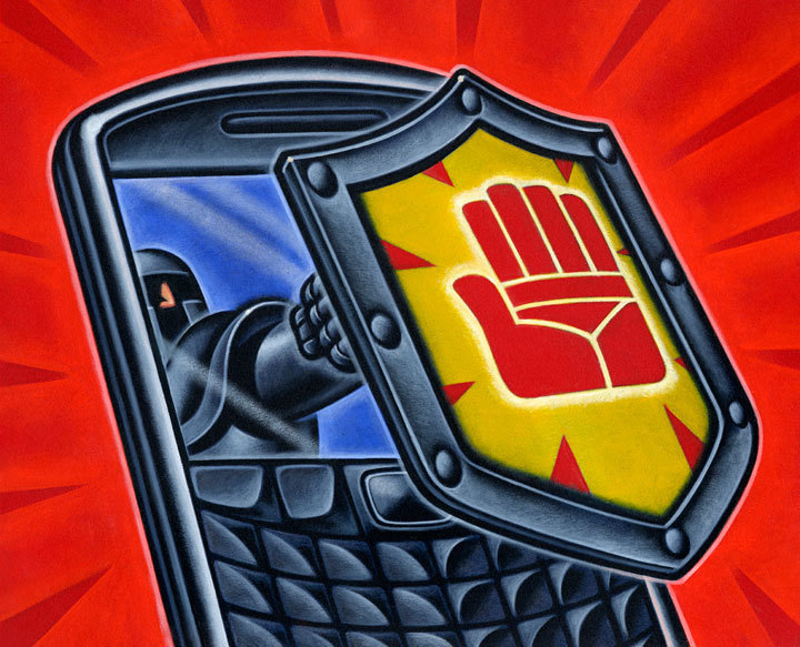
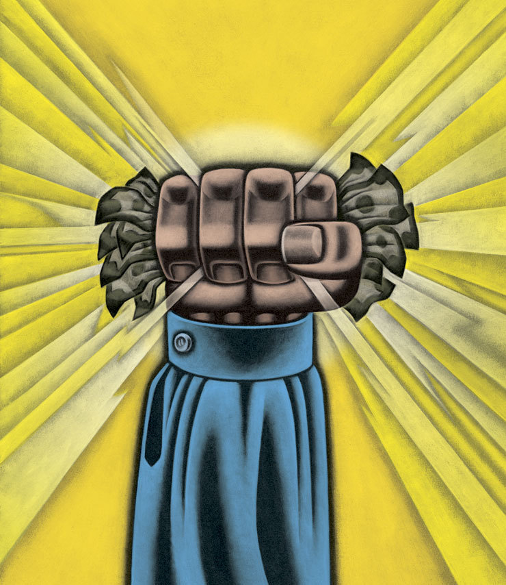
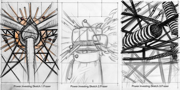
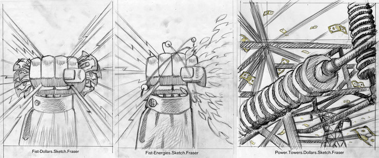
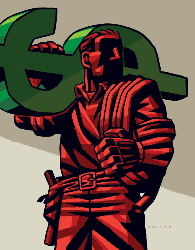
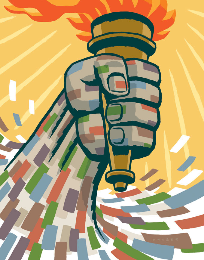
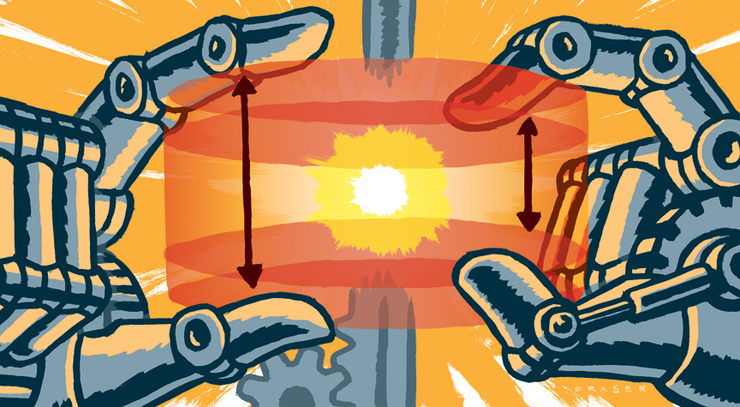
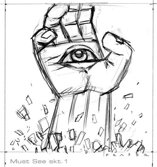
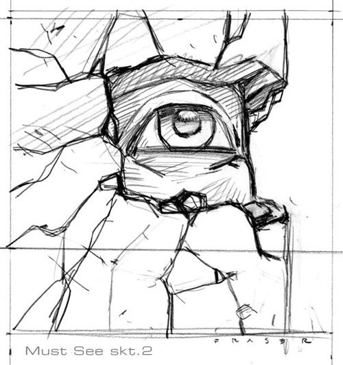
Over the last few years the symbolism of a hand has stood in for that of a figure in my work. In quite a few of my recent assignments the need to indicate an individual can be fraught with questions of nationality, race, and others. For many years I developed a figure with a generic structure purposefully. There was, and have been questions when I worked of making sure that the figure was not too "scary". Use of shadows, and usually requested powerful figures made some clients uncomfortable even though it was that very quality that had them calling on me. After working through many sketches, the simplicity of the hand as a representation of a group with the fingers, or just a lone individual, and many of the nagging questions went away. I do enjoy working with the figure still, but … well in many cases it's ended up being a hand. This last week it was a hand for the Wall Street Journal. An article on investing in power & utilities, and the editors wanted POWER. It was the art director, Orlie Kraus who called. Hell we even talked on the phone! Not just email, and text. Well Orlie & I worked hard to offer the editors(word people) solid choices. The first round of my sketches were sent, and well so it went. The Hand was the editor's pick. Next was the request for "Show Me The Money", dollar sign, and dollars added. With the second round, Orlie tried to offer our favourite of the utility towers for reconsideration. Nope, it was POWER that was wanted, and the hand was waved through. I went at the hand to make it as powerful as requested!

First round sketches.

Second round sketches.

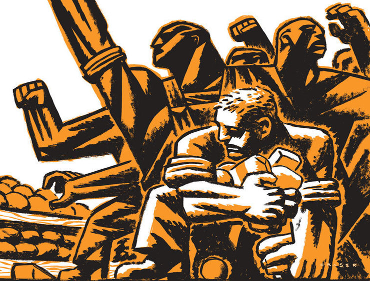
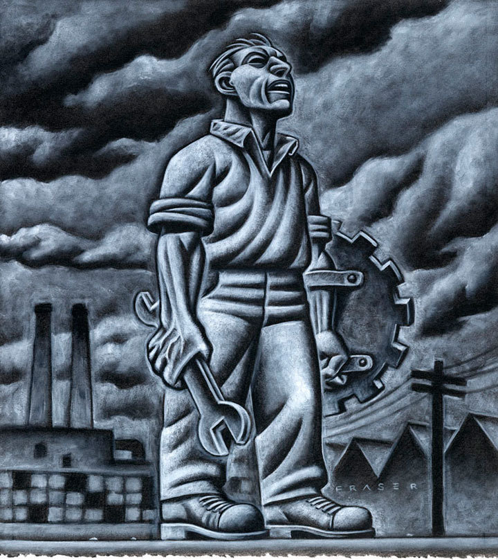
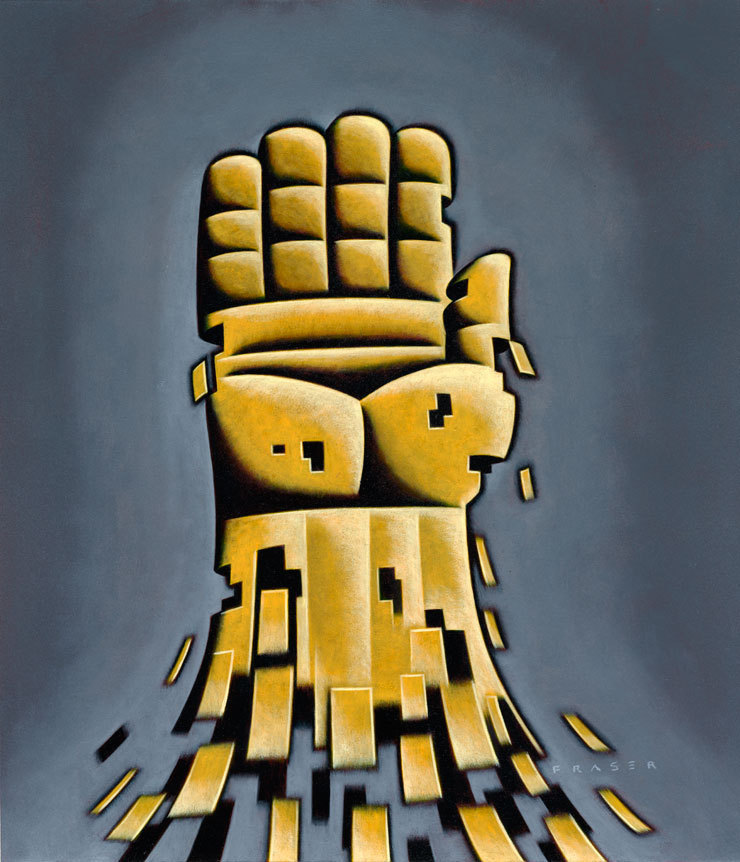
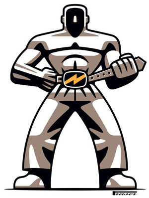
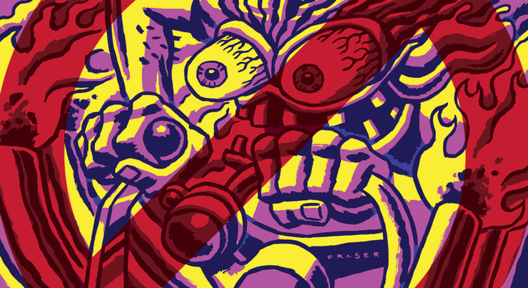
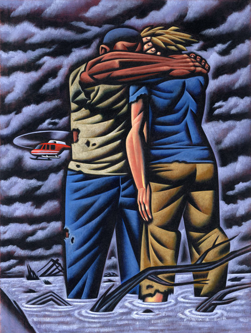
Another recently published hand based illustration done for the National Federation of Labor. Subject; Organize The Unorganized!

permalink | comment
Topical: Editorial  

Prius & Porsche

AUGUST 23, 2010

Couple of recent assignments were car related. First one was a cover for an international edition of Newsweek. The title was the Flying Prius about the never ending dream of the flying wing. It's the pursuit to bring the energy efficient qualities of the flying wing shape to the mainstream commercial aviation industry. Creating a version of the Prius for the airline industry. Art Director; Adolfo Valle.


Final direction

Close-up

The next one was for Motor Trend. Its a regular column with a roving subject. This month's about the enjoyment and build of a classic Porsche replica. These newly built replicas are mechanically superior to the original,  while retaining the original classic lines, and interior look. Allowing the owner peace of mind of not putting an original in harm's way while driving in the real world. Personally I'd still be sweating as these high quality replicas are not cheap either. Title for the column was; Auto Avatar, the bathtub Porsche reimagined in Cameron-grade HD/3D/CGI brilliance. Art Director; Andy Foster.

Yes, that's a Navi at the wheel.

permalink | comment
Topical: Editorial  

Piercing

AUGUST 2, 2010

Illustration for Research News 2010 summer issue. The idea for this illustration was to simply indicate the piercing of a cell membrane. In an article about taking apart an infectious disease, the subject of Dr. Stefan Pukatzki, who has uncovered a new method that bacteria use to cause disease. The art director for this assignment was Lara Minja, of Lime Design inc. Lara, and I aimed for a simple graphic. I worked in a vector based approach as it lent itself to a clean image with rich colours. The precision of piercing a cell, and injecting material is the work of a labratory, and medical research. I enjoyed the opportunity to explore a somewhat abstracted way of designing the image in my sketches. There is space in the upper area for type as well. I enjoyed working with Lara.

Pencil Sketches

permalink | comment
Topical: Editorial  

Muscle & Shadow

JULY 21, 2010

Couple strong guys for recent assignments. A full page image about labor costs for Convene magazine. The next one is for National Geographic online, and about reducing energy use, that's belt tightening. Another one for Motor Trend, well it's shadowy, and about an American "muscle" car. The Mustang, the original pony car becomes a thoroughbred.


permalink | comment
Topical: Editorial  

World Cup

JUNE 7, 2010

Well it's been awhile since I've done a TIME cover. D.W. Pine emailed asking if I was available over the Memorial Day weekend. No one phones anymore, and maybe D.W. needed someone who wasn't going anywhere for the weekend, Ha! He thought a very strong graphic, poster-type cover with a player and ball would be cool in my style. Very straight forward, and to the point. Fine with me, as I enjoy the opportunity to really explore a object in it's structure. One of the bigger choices for me was whether to portray the traditional black & white soccer ball. I went with a more contemporary looking ball as it describes more appropriately the feeling to the event held in South Africa. As with any current cover work, there is the need for providing space for the necessary text, and masthead while maintaining the energy. Originally the text was to be on the left, but after an Editor review it was now on the right.  The Editor wanted a single player making a kick from the back, as I had done with another sports image of a baseball player. Not highlighting any one player was the goal.

First round of sketches with text in the lower left.

Text moved to the right. The energy was not going in the 4th sketch. I sent D.W. another even before he responded to #4.

Base drawing for paint. The number 19 is for the 19th World Cup. On to finish, and back to the top.

permalink | comment
Topical: Editorial  

Cargo

JUNE 1, 2010

Roy Comiskey coined a great description about the last assignment we did. It's in the June issue of Security Management magazine. After seeing some of my gallery pieces, Roy thought my approach would be great for the cargo security topic of an upcoming article. Roy has been one of the most open Art Directors I've worked with. He's allowed me the space to explore my approach in many different ways over the years. Being one of the first A.D.'s to embrace my digital work back in the mid 90's. He described some of my newer pieces as Pop-Realism. I quite liked the term. It's a vector based approach, done in Adobe Illustrator. In my gallery work, I usual work up the color, and structure in a vector based study for the final paint. The gallery work is done in oils, but for publishing purposes the digital works best.

permalink | comment
Topical: Editorial  

Slow Ride

APRIL 12, 2010

This month's Cycle Canada has an article that rings so true for me. Yes, it's my illustration that accompanies the article, and I'm honored. I was asked by Neil Graham, the editor, to contribute to another finely written article by Ted Bishop. Ted's done some award winning writing. The idea being put forth; Tempo Giusto: In Praise of the Slow Ride. I worked with the very talented, Chris Knowles. He's the art director that keep's up-righting the magazine when it's visually gone off.

An excerpt of the article gives the feel;

Coming out of the concert hall up on the mountain in Banff, where young musicians had been performing Beethoven’s 7th, I thought – Maybe a long ride should be like a symphony. If it’s all allegro it becomes like those crazy bluegrass sessions where the picking starts fast and just gets faster. An andante movement defines the fast; you feel how much pleasure can be wrung from a single note, a single turn. At the end both movements resonate within you. I presented this theory to my partner Hsing, a classical musician, thinking she’d be impressed. She said, “This is just an excuse to buy another motorcycle. I know you.” I feigned aggrieved innocence. Did she know that before the concert I’d heard the throb of an old Guzzi Eldorado coming up the hill? I dropped the topic, but this winter I’m going to be scanning the classifieds for an old thumper, a mile-muncher, not a road-burner. There’s a new breed of rebel out there, and they’re riding any damn speed they like. I’m going to tattoo “Born to Burble” across my chest and join them.

Ted Bishop.

Early sketches for one pagers.
Sketch for possible spread.
Final art
permalink | comment
Topical: Editorial  

Working

MARCH 31, 2010

Tomorrow's April 1st, well although another month away is May 1st. One of recent assignments was on the history of May Day, the international day for the recogonition of the workers of the world. The article I illustrated was about International Worker’s Day and Canada’s contribution. "While May 1st, International Workers’ Day, is commemorated as Labour Day in most countries around the world, in Canada and the United States, Labour Day is the workers’ holiday celebrated at the beginning of September. Both, however, celebrate the achievements of the labour movement in securing workers’ rights". Well Sisters, and Brothers, here's wishing you well on March 31st.
• On a very happy secondary note, I've followed Richard Down's example, and moved my home website. After tens years my site was getting old and clunky. Mr. Zimm dialed the performance back up. I'm happy to have my website resources connected & working together now.

http://www.fraserart.com

Full spread
Detail.1
Detail.2
permalink | comment
Topical: Editorial  

Sedan

MARCH 5, 2010

As a follow-up to a previous assignment from Motor Trend magazine, about an evolutionary process, I was asked to do another one about the popular sedan. From a '49 Chev, '55 Chev, '66 Impala(Chev), '76 Cutlass(Olds), '82 Escort(Ford), to a '89 Taurus(Ford). The art director Andy Foster thought keeping the feel of the previous evo illustration was the way to go. It's kind of like playing with little metal cars as when I was a kid. Definite nostalgia. Well it's in the March issue, on newsstands now.

1/3 of spread art
2/3 of spread art
3/3 of spread art
Full spread
Previous spread on the evolution of the diesel.
permalink | comment
Topical: Editorial  

BizWeek After Bloomberg?

JANUARY 1, 2010

In December I worked with Don Besom at BusinessWeek . It was interesting talking with Don, now that the magazine is owned by Bloomberg it remains to be seen what's next. There was a sense of melancholy recalling all the people I met while working on BusinessWeek assignments. I can remember walking into the McGraw Hill building to drop off my portfolio back in 1985. I've contributed illustrations on & off over the years. The latest was a book review on the subject of the contemporary CEO as seen by a couple of French academics. The book title is; From Predator to Icons.

 Also below is the very first assignment I ever did for BusinessWeek. It was about the farming crisis in the midwest. The Art Director was Sharon Bystrek. Well, farming is not creating the same headlines these days. It's forward into 2010.

riffing Picasso
oils on heavy paper stock

• Below is the thumb sketch I did for my first ever BusinessWeek assignment in 1985.

Final art - oils on strathmore paper
Cover art sketch on Third World debt around early '87.
Final art - oils on strathmore paper
This was a special issue. I also did all the open art for each section, about five other illustrations. All the art was painted in the last month of '85. Art Director; Malcolm Frouman
One of the interior pieces. That computer was high tech.
Another interior from the Industry Outlook issue.
Mr. Gorbachev came for a visit.
permalink | comment
Topical: Editorial  

Left Light

NOVEMBER 30, 2009
Art done with brush & ink, and old school hand separating, plus Adobe Illustrator software

An illustration I did recently for UU World magazine. The magazine is published by the Unitarian Universalist Association of Congregations. As religious entities go, the Unitarians seem reality inclusive, and liberal. Religion for me is a very prickly subject, and more so with a life lived. I belong to no particular faith. The subject of the Religious Left was the basis for the article for which I was to do a full page illustration. Being bombarded daily with the news of America, here in Canada, it seems as though our close neighbors to the south are becoming more & more a theocracy. Against the current backdrop of today, the longer tradition of a more inclusive mindset in the religious life of America was outlined in this article. The socialist aspects of Christian doctrine are usually bulldozed by the contemporary materialist culture. Through the struggle to remove barriers, and broaden the general well being of the many over the few, the Religious Left has a long history. The idea of light/liberty for the commoner, and many facets of the struggle coming together into a stronger collective. I'd chosen a hand drawn quality with a graphic application for a more fresh feel, over the traditional oils on canvas.

permalink | comment
Topical: Editorial  

Gasser Memory

NOVEMBER 8, 2009

Okay yes, it's another Motor Trend, but I'm having fun. This one's about the myth of heavy footed motor freaks. Also an opportunity to pay homage to the memory of Big Daddy. My apologies, but it was fun. From a time when counter culture still was. Thank you Andy Foster!

On the newsstand now.
permalink | comment
Topical: Editorial  

Work & Bernie

OCTOBER 8, 2009

I've been kinda crazy busy the last while. Most of the work I've done has not printed yet. Here's some more Motor Trend art which is always fun for me. After reading Harry's post I looked at the my old Swamp Thing copies. Bernie Wrightson made my head rock.

Electric or Gas, what's the mix?
Driving Benzs on the Nurburgring.
Harry, It was the comic book stand at the grocery store down on the corner which had me checking almost daily. I'd drop my bike on the ground outside the entrance, and head in to drink in all the covers. The magazine stand, and wire rotating comic book stand was the greatest art gallery in my life. The first copies drawn by Wrightson were the best! Sept-Oct 1973 issue
permalink | comment
Topical: Editorial  

Train Spotting

SEPTEMBER 9, 2009

Recently I worked with Joseph Heroun at The New Republic magazine. We worked on the cover art. We've worked together before, and he was one of the first art directors to encourage me to work with a my more simple direct approach. Joe had an idea in mind which he described to me. I liked the idea as well, and after a few rough sketches, final art was under way. We wanted to keep the colors somber, and dark. The sketches have their own quality which I liked. I began to wonder if executing the piece in an alternative approach might be better. I was waffling, but Joe's direction was a real support. I've found that "sketching" roughs for a looser direct brush mark can get tricky. The direct graphic brush approach in the final is difficult to indicate with a pencil. The rough sketches tend to veer towards another approach. I am proud of the final cover, and the Art Director played a very helpful role in this situation. I'm not always thrilled with concepts floated at me, but when it's working in my opinion....well it's working.

Joe & I discussed the first roughs.
A middle scale for the train was sketched out.
Cover with final text.
permalink | comment
Topical: Editorial  

Shocking

AUGUST 4, 2009

Another automotive Technologue Illustration from Motor Trend. There are many engineers trying to harness energy from many of the mechanical processes going on in a moving car. Well what about the energy generated in shock absorbers? Well it's being developed now. The energy & heat in the shock absorbers of a car can feed power into the electrical system. This means that a bumpier road just might just be the better one. The details are on the newsstand now.

bouncing the sketches
Yeehaw!
permalink | comment
Topical: Editorial  

Punks

JULY 9, 2009

Last July 4th weekend I did a cover for LA Weekly. Subject is, "how two veterans of the L.A. punk scene wound up on a collision course, until only one was left standing, the other shot once through the heart at point-blank range with a .25 caliber handgun". The art director, Darrick Rainey suggested the classic face card composition, and I offered a scene sketch. I fleshed out his suggestion which I liked as well. Went with the brush and ink approach for a "punky" feel. Bright contrasty colors for newsprint. Fun assignment.

Final art
permalink | comment
Topical: Editorial  

Sub Bust Security

JUNE 29, 2009

Recently finished assignment with the art director, Roy Comiskey, at Security Management magazine. Working with Roy is a pleasure. He's a real fan of illustration and painting. Talking over the assignment with him is a mix professionalism, and fun. The subject is about the ongoing struggle to stop converted vessels loaded with illegal drugs from entering U.S. waters. The converted vessels are sub-like in their final form. Very low to the waterline as to make them almost undetectable.

Above view.
Down low, and level.
Final art.
permalink | comment
Topical: Editorial  

Running Around

JUNE 11, 2009
sample of mine for direction preferred by the art director.

It was a smaller illustration, not a full page, but it kept me redoing sketches. An illustration for Runners World, which I thought was going one direction went another. The same subject with a different spin seems to be the challenge with this part of the magazine. At least that is my take on it. The subject is of a runner, in this case highlighting training for strength. The art director, Marc Kauffman, wanted a graphic(not painted) approach. He had picked an image I had done before as a guide to what might work. It was a vector piece from my website. Well I ended up going with more of my brush and ink approach. Here's the sketches, and final. In the end patience, and perseverance, we got there.

"Strong like Bull"
no banana - too much beef
Picks #4, but wants a different face.
Face is too round, also alter the chain for the text to flow around.
Finally the finish!
permalink | comment
Topical: Editorial  

Grinding Gears

MAY 12, 2009

I'm still grinding gears with Andy Foster at Motor Trend magazine, and lovin' it. The Technologue column is at the front of the magazine, and highlights mechanical topics within the automotive world. My Father was a civil engineer who impressed upon me an armchair appreciation of machines. Doing illustrations of the workings in engines is an interesting challenge. My images are definitely not the noble diagrams of engine manuals, but a playful riff on the subjects.

This one is about planetary gears. They're usual in transmission applications.
We're talking about variable combustion ratios, VCR, not old tapes. This is pretty amazing technology that increases an engine's capabilities while greatly impacting it's fuel consumption on the fly.
permalink | comment
Topical: Editorial  

After the Flood

MARCH 24, 2009

Recent illustration for the National Labor Federation. Subject is the disaster in disaster relief. Katrina, and other major events have exposed the failure of the Government's ability to address these crises. The stock market rallied yesterday, but that crisis was manmade. The other events/crises quite often end up going begging, and relying on charity. In some ways I felt the image kinda describes the landscape on a couple of levels.

permalink | comment
Topical: Editorial  

Pastime

FEBRUARY 9, 2009

Aviva Michaelov phoned with an assignment for the week in review section of the New York Times. The art was for the weekend of the Super Bowl, and subject being on America's number one pastime. I guess in a number of survey's it's been football that has come out on top. Although more people actually play baseball. Basketball's placement varied from survey to survey. The art was going to appear in color, and black & white. I shuffled the colors for the different applications.

sketches
color - website usage
black & white - newspaper
permalink | comment
Topical: Editorial  

Nuclear Pies

SEPTEMBER 30, 2008

Just hitting the newsstand in Alberta, Canada is the most recent issue of Alberta Views Magazine. Alberta, for those that don't know is north of Montana, on the east side of the Rockies. Oil, and ranching are big in this Canadian Province. There is a ironic issue being pounded out in Alberta surrounding the question of nuclear power. Alberta is home to one of the largest oil deposits in the world, yet is being pressured by the nuclear industry to build a reactor in the north part of the province. The article I did illustrations for seemed well written and detailed. The Nuclear industry will always frame the question in an either-or manner, to achieve the prescribed answer. The discussion of Renewables, and their future development, and growing strength is quickly dismissed by the Nuclear factions. Also real bottom line numbers on the cost of Nuclear is never shown in the light of day. The term "Bullshit" is in the text, and backed up. The opening illustration is obvious in subject, with the half page image follow-up being the Renewables, wind & solar. So I've now painted crap, to the affirmation of some.

Opener art
Half page - The Renewables, Wind & Solar
permalink | comment
Topical: Editorial  

Something in Summer

AUGUST 14, 2008
Summer is not long enough here in the north. On the newsstands now the September issue of Mens Health, I've an illustration. The subject was a list of 15 must see things. The subject matter was very wide which made it quite difficult to narrow down to show all fifteen items. I guess a two page spread might have worked.  The text is a list of  fifteen must-see-items in a bullet format. The list of items were to get the "Contemporary Male" off his electronic gizmos, and into the real world. Some of the list includes; Open heart surgery, the grand canyon from the air, a Mark Rothko painting, a local dump/landfill, a desert flower bloom.....and more. Each item was a couple of sentences. Maybe it should have been a picture book for the contemporary humans....hmmmm. Oh well difficult to cram into three quarters of a page. In my first two sketches I just tried to convey a feeling of breaking free. In my third sketch, was a feeling of being awe struck, and blown away. I included a cell phone to represent the electronic gizmos. With the background being the shredding of the "Contemporary Male's" world. The art director, John Dixon, wanted a graphic look. Fine, so I worked with brush & ink, and hand separations keeping a graphic feel with a hand done execution. I gotta get back outside.
permalink | comment
Topical: Editorial  

Diesel Evo

JULY 1, 2008
Andy Foster is the art director at Motor Trend magazine. I've worked with Andy on a number of assignments.  Most of the images in automotive magazines are photography. I enjoy the freedom to use different media approaches when I feel they better suited the assignment. Also I enjoy contrasting the approach with the subject. Instead of the harder edged approach of vector I wanted to add a human quality to the mechanical subject matter. Andy called with a spread illustration for the evolution of the diesel. I was directed to include certain vehicle models from the past. The present day diesels are very different than their truck based ancestors. I did offer different approaches in the sketch phase, but the feeling went to the evolutionary steps. I still think the "Dinosaur" #3 sketch could have been fun. Still the challenge of resolving the morphing from one model into the next, and dealing with the old gutter ending up being my main hurdle. The illustration is on the newsstand now, but of course a few months back when I did this assignment the pain at the pump was mounting. Diesel prices are tracking gasoline, maybe the bicycle should have been the last stage on the right?
Left side
Gutter
Right side
Spread
permalink | comment
Topical: Editorial  

Iraq + Film

JUNE 25, 2008
I've been doing a mix of assignments lately. Some editorial, and some advertising. With the current economic picture coming daily at me through the media it does feel good to be working. In the most recent issue of Mother Jones, the section Media Jones, I've done an illustration. The subject being the Iraq war film, and the failures to date. Hollywood has not produced a project that has connected with the American public. In my opinion it might just be too early historically to have perspective on the subject. Attached are my sketches and the final art. I wanted to try and describe the disconnect between war & Hollywood, plus a pathos in the lone over burdened soldier. The soldier is isolated and alone. For final art my art director, Allison Milmoe requested an approach I've done with brush & ink, and my computer. It's old school hand separations. It felt good to have worked with Mother Jones after quite some time since I last did.
permalink | comment
Topical: Editorial  

Texas Monthly small run

JANUARY 10, 2008
Something to get the ball rolling. A little while back I was doing a regular page for the Texas Monthly magazine. It was a kind of currents events page. It started with TJ Tucker as art director. Then quite quickly I was working with Rachel Wyatt. The last few were done with Andi Beierman. Most were done with Rachel Wyatt, and she was very easy to work with. I usually got an email near the end of the month that outlined the subject. The subject or themes were were varied. Which allowed me to move around some with the feel of each piece. I also was encouraged to try and vary my technique for each. The page was titled "The Filter: Events". Sadly it became ground down somewhat over the last few assignments due to heavier direction. My experience lasted about a year and half. The experience I enjoyed over all.
Texas Rodeo
Essence music festival
Shakespeare festival
Indy car race
Exhibition of Lucy's bones
Review of the Menil modern museum in TX
HighschoolFootball
Japanese culture
Construction of a new contemporary museum
Carol Burnett
permalink | comment
Topical: Editorial