Douglas Fraser

2009

Left Light

NOVEMBER 30, 2009
Art done with brush & ink, and old school hand separating, plus Adobe Illustrator software

An illustration I did recently for UU World magazine. The magazine is published by the Unitarian Universalist Association of Congregations. As religious entities go, the Unitarians seem reality inclusive, and liberal. Religion for me is a very prickly subject, and more so with a life lived. I belong to no particular faith. The subject of the Religious Left was the basis for the article for which I was to do a full page illustration. Being bombarded daily with the news of America, here in Canada, it seems as though our close neighbors to the south are becoming more & more a theocracy. Against the current backdrop of today, the longer tradition of a more inclusive mindset in the religious life of America was outlined in this article. The socialist aspects of Christian doctrine are usually bulldozed by the contemporary materialist culture. Through the struggle to remove barriers, and broaden the general well being of the many over the few, the Religious Left has a long history. The idea of light/liberty for the commoner, and many facets of the struggle coming together into a stronger collective. I'd chosen a hand drawn quality with a graphic application for a more fresh feel, over the traditional oils on canvas.

permalink | comment
Topical: Editorial  

ABSOLUT Vancouver Launched

NOVEMBER 12, 2009

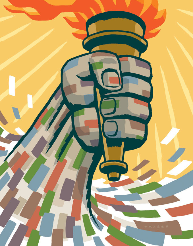
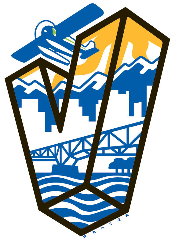
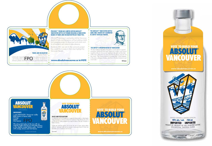
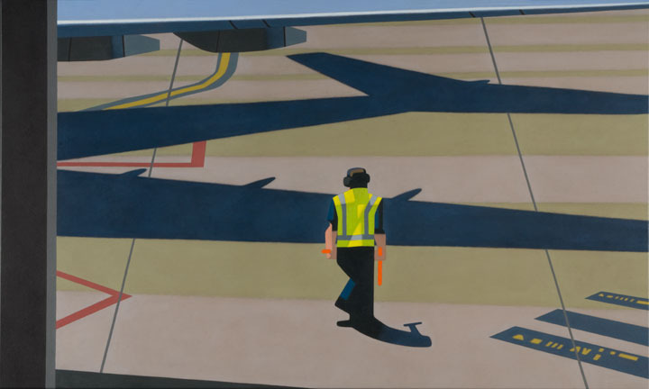
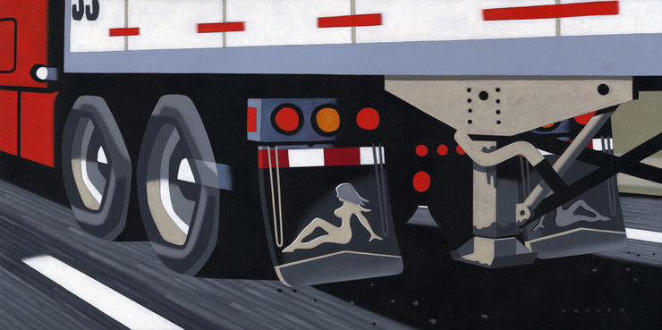
ABSOLUT VANCOUVER launched November 10th! Tah-dah, a special edition limited run city themed bottle, ABSOLUT Vancouver. The graphic brand of ABSOLUT is a big one, and includes quite a body of work. So when I received the invitation to create a city themed, and one of a few special city themed labels, this one for the city of Vancouver, I was very excited. As a west coast resident(British Columbia) it's was great to pay homage to one of the most vibrant west coast cities on the planet. Vancouver has a very contemporary skyline set against gorgeous snow capped mountains. With classic float planes coming and going, connecting the city centre to communities on the neighboring islands, and up the coast. There are bridges that link the city centre as well to the greater area of the more suburban communities. The city has a great blend of natural beauty with a strong urban character based on access to some of the most spectacular scenery around, plus being the gateway city on Canada's west.
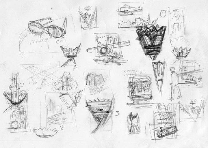
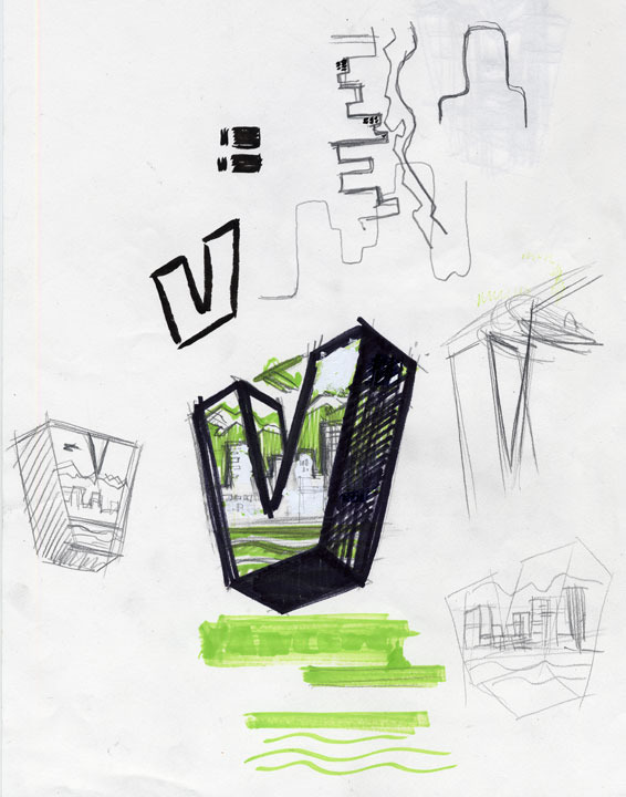
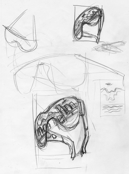
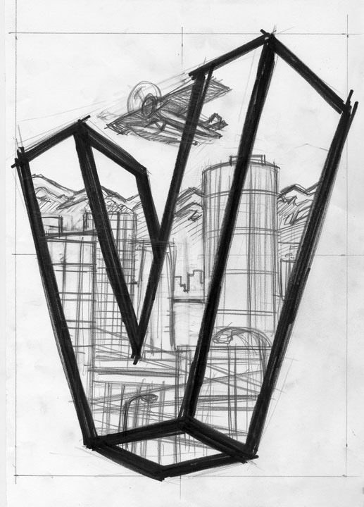
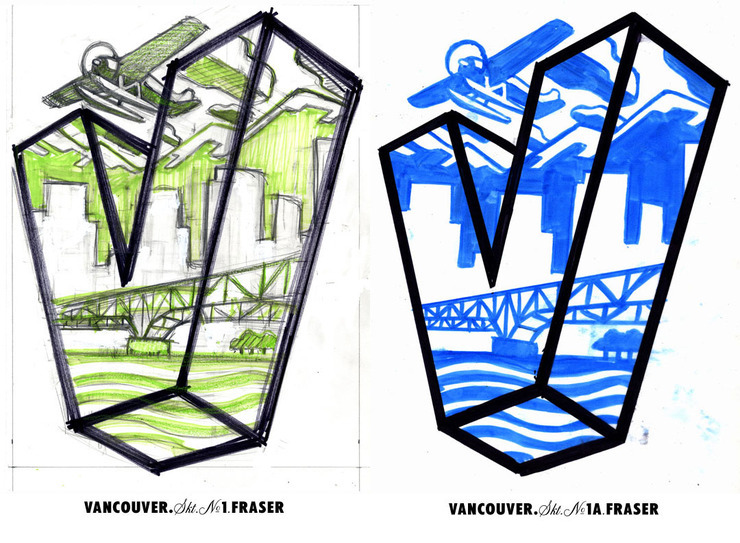
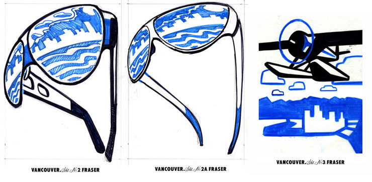
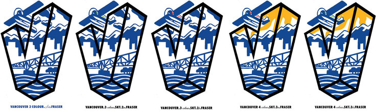
I developed a couple of approaches, but always wanted at least one of those Canadian classic de havilland beaveresque float planes in the image. I developed thumbnails, thought about the quality of life I've experienced in Vancouver. Looking at the typography that Absolut has established. The bottle and it's clean lines with the clear glass canvas had me deciding that a clean vector would marry well with the surface, and look contemporary. The pop-heraldic chevron shape "V" really stuck in my mind. It was on old Vancouver Canucks hockey jerseys. From finding a direction it was about reducing the elements to their primary shapes, and composing the positive & negative shapes inside the "V". The blue and gold tie into the Swedish heritage of the company, and the provincial colours of British Columbia. Nature, urban, sun from provincial flag, downtown linked to the surrounding communities by bridges, The trees and running trails are there under the bridge, The Classic float plane connects the urban to the mountains, the "V" shape(chevron shape like two raised up arms) , all inside the area of a bottle label. Also I wanted to see the final art screen printed onto the bottle. The more tonal blending, or loose an image was, the more it would be necessary to develop a sticker label which is not what I wanted. ABSOLUT asked me to sign my work, and it would be printed on the bottle with the label. They showed a great interest in respecting me, and my process. The people I want to thank a lot are Kelly Kretz at Corby's, Craig Bond at B Street, and Stan Olthuis at Sharpshooter. Without them it would not have happened. The bottle is a limited run, and will be done probably by the holidays.
A dollar from the sale of every bottle goes to a $120,000.00 donation to a local arts project. There is a list of five possible receipts for the $120,000.00 donation on the ABSOLUT website; http://www.absolutdrinks.com

the label as it printed


The neck tag was developed through B Street. Many thanks.
permalink | comment
Topical: Advertising  

Gasser Memory

NOVEMBER 8, 2009

Okay yes, it's another Motor Trend, but I'm having fun. This one's about the myth of heavy footed motor freaks. Also an opportunity to pay homage to the memory of Big Daddy. My apologies, but it was fun. From a time when counter culture still was. Thank you Andy Foster!

On the newsstand now.
permalink | comment
Topical: Editorial  

Gate D43

NOVEMBER 2, 2009

I've finished another canvas. The subject was a photo I shot out the window of an airport while waiting for our flight. I developed my sketch from elements in my photo. The tarmac/concrete had subtle bands of tone. I worked up a pencil, and did a colour study in vector. The most time consuming part feels more like the stretching of the canvas, and pencilling in the base drawing for paint. The opacity I want takes about 2-3 coats per colour. The final canvas is 24 by 40 inches. The colours in the photo of the canvas are somewhat too vibrant, the final painting is a little more neutral than the image on the monitor. I painted the sides of the canvas as well. The depth of the stretcher gives a feeling of object that I wanted. The painting has a quality the digital colour study just does not have. I do enjoy them both for different reasons. And yes Mr. Rogers, no masking tape was used.

Pencil & Vector colour study
Colours are off in the photo. Original canvas is more subdued. Oils on canvas, 61cm by 102cm.
Figure detail
side painting details

Work & Bernie

OCTOBER 8, 2009

I've been kinda crazy busy the last while. Most of the work I've done has not printed yet. Here's some more Motor Trend art which is always fun for me. After reading Harry's post I looked at the my old Swamp Thing copies. Bernie Wrightson made my head rock.

Electric or Gas, what's the mix?
Driving Benzs on the Nurburgring.
Harry, It was the comic book stand at the grocery store down on the corner which had me checking almost daily. I'd drop my bike on the ground outside the entrance, and head in to drink in all the covers. The magazine stand, and wire rotating comic book stand was the greatest art gallery in my life. The first copies drawn by Wrightson were the best! Sept-Oct 1973 issue
permalink | comment
Topical: Editorial  

Comixology

OCTOBER 1, 2009

Awhile back I did my own little comic book. Chris Pitzer of Adhouse press published my thirty-two page graphic poem. I loved working on it, and exploring the process. Chris was and is very supportive. He's a huge fan of comics and producer of some gorgeous books. Adhouse Publishing is now offering several of it's titles for enjoying in a whole new way. Comixology is where you can get a digital copy of many comics.

http://comixology.com  

on facebook http://apps.facebook.com/comixology 

on iPhone http://www.comixology.com/iphoneapp

Ahouse Books site http://www.adhousebooks.com


permalink | comment
Topical: Other  

Harry & I

SEPTEMBER 23, 2009
permalink | comment
Topical: Other  

Pole Dancing

SEPTEMBER 15, 2009

I finished this painting about a month ago. I was out and about in an industrial part of my home city. The infrastructure of cities does interest me. The unobserved is interesting to me for it's unassuming aesthetic. The wires, and neutral tones struck me. The linear qualities of the cables have direct abstract qualities. After developing a sketch, I did a color study in vector. I decided to drop out the sky for a more graphic feel in the cables. The painting is 30 by 40 inches, oils on canvas.


Train Spotting

SEPTEMBER 9, 2009

Recently I worked with Joseph Heroun at The New Republic magazine. We worked on the cover art. We've worked together before, and he was one of the first art directors to encourage me to work with a my more simple direct approach. Joe had an idea in mind which he described to me. I liked the idea as well, and after a few rough sketches, final art was under way. We wanted to keep the colors somber, and dark. The sketches have their own quality which I liked. I began to wonder if executing the piece in an alternative approach might be better. I was waffling, but Joe's direction was a real support. I've found that "sketching" roughs for a looser direct brush mark can get tricky. The direct graphic brush approach in the final is difficult to indicate with a pencil. The rough sketches tend to veer towards another approach. I am proud of the final cover, and the Art Director played a very helpful role in this situation. I'm not always thrilled with concepts floated at me, but when it's working in my opinion....well it's working.

Joe & I discussed the first roughs.
A middle scale for the train was sketched out.
Cover with final text.
permalink | comment
Topical: Editorial  

Summer Memory

SEPTEMBER 2, 2009

Fun piece for a themed group show in Calgary, CANADA. The title of the show is Bonfires. It's at the Uppercase gallery. The painting is oils on wooden panel, 9 by 12 inches.

permalink | comment
Topical: Other  

Shocking

AUGUST 4, 2009

Another automotive Technologue Illustration from Motor Trend. There are many engineers trying to harness energy from many of the mechanical processes going on in a moving car. Well what about the energy generated in shock absorbers? Well it's being developed now. The energy & heat in the shock absorbers of a car can feed power into the electrical system. This means that a bumpier road just might just be the better one. The details are on the newsstand now.

bouncing the sketches
Yeehaw!
permalink | comment
Topical: Editorial  

'65 Pan

JULY 23, 2009

Many other manufactures have tried to copy the line it laid down, and not been seen to do so. I've looked closely at the copies, and see the many plastic parts that stand in for the metal of the original. I'm not a chopper fan, no obnoxious pipes please, just an original used, but not abused classic. It's not the only bike I care to own, just one of a hundred. The name alone is a theme, Electra Glide.

1965 Electra Glide - Pan Head engine
no "Buddy" seat, just a classic "Pan" seat.
permalink | comment
Topical: Other  

Punks

JULY 9, 2009

Last July 4th weekend I did a cover for LA Weekly. Subject is, "how two veterans of the L.A. punk scene wound up on a collision course, until only one was left standing, the other shot once through the heart at point-blank range with a .25 caliber handgun". The art director, Darrick Rainey suggested the classic face card composition, and I offered a scene sketch. I fleshed out his suggestion which I liked as well. Went with the brush and ink approach for a "punky" feel. Bright contrasty colors for newsprint. Fun assignment.

Final art
permalink | comment
Topical: Editorial  

Sub Bust Security

JUNE 29, 2009

Recently finished assignment with the art director, Roy Comiskey, at Security Management magazine. Working with Roy is a pleasure. He's a real fan of illustration and painting. Talking over the assignment with him is a mix professionalism, and fun. The subject is about the ongoing struggle to stop converted vessels loaded with illegal drugs from entering U.S. waters. The converted vessels are sub-like in their final form. Very low to the waterline as to make them almost undetectable.

Above view.
Down low, and level.
Final art.
permalink | comment
Topical: Editorial  

Right Practices

JUNE 18, 2009
permalink | comment
Topical: Other  

Running Around

JUNE 11, 2009
sample of mine for direction preferred by the art director.

It was a smaller illustration, not a full page, but it kept me redoing sketches. An illustration for Runners World, which I thought was going one direction went another. The same subject with a different spin seems to be the challenge with this part of the magazine. At least that is my take on it. The subject is of a runner, in this case highlighting training for strength. The art director, Marc Kauffman, wanted a graphic(not painted) approach. He had picked an image I had done before as a guide to what might work. It was a vector piece from my website. Well I ended up going with more of my brush and ink approach. Here's the sketches, and final. In the end patience, and perseverance, we got there.

"Strong like Bull"
no banana - too much beef
Picks #4, but wants a different face.
Face is too round, also alter the chain for the text to flow around.
Finally the finish!
permalink | comment
Topical: Editorial  

Chrome Lady

JUNE 4, 2009

Recently finished gallery work. Oils on wooden panel, 24" by 12". I'm looking toward a subtle level of abstraction. I'll being pushing in that direction with a more reductive look on my next one.

Study Sketch
Final Painting
Detail

Farewell Pontiac

JUNE 1, 2009

Follow-up to Carl's post. Ole' Goats are passing by as GM says good-bye to Pontiac. I did own a '68 GTO years ago. I know their time has past, but the memories are real. I couldn't add the cool Judge logo in this illustration for copyright reasons. The cars that sport the Pontiac logo today just leave my jaw on the ground in disblief.

permalink | comment
Topical: Other  

Grinding Gears

MAY 12, 2009

I'm still grinding gears with Andy Foster at Motor Trend magazine, and lovin' it. The Technologue column is at the front of the magazine, and highlights mechanical topics within the automotive world. My Father was a civil engineer who impressed upon me an armchair appreciation of machines. Doing illustrations of the workings in engines is an interesting challenge. My images are definitely not the noble diagrams of engine manuals, but a playful riff on the subjects.

This one is about planetary gears. They're usual in transmission applications.
We're talking about variable combustion ratios, VCR, not old tapes. This is pretty amazing technology that increases an engine's capabilities while greatly impacting it's fuel consumption on the fly.
permalink | comment
Topical: Editorial  

Tagged Grain

APRIL 8, 2009

Still working on my illustration assignments, but stayin' up a little later to do some of my own stuff. I painted a grain car that was parked on the rails in my home town. I was back visiting family in Alberta. The western prairies are home to a lot of grain, barley, flax, and canola. The cars wear the markings of their journeys. I wanted to distort the car, and get that big sky. It's oils on a wooden panel. Horizontal formats are my favs, and usually don't fare well in the print world, or on monitors. I added a detail to try, and offer a feeling of the surface.

Slugger

MARCH 25, 2009
2/8 Sketches. This is my second sketch. I was impressed with the character development for a younger reader. The book did not seem preachy or speak done to the reader. Also there was one girl on the team. She had a pink glove. I wanted to make one of the gloves pink amid a bunch of scruffy boys.
oils on board

Well I did a young adult book cover my first. It's as close as I've done to a children's book in my life lately. I did do David & Goliath years ago. The art director, Rich Deas, ran me some. He's a good guy, but I was starting to..... well here's the sketches, and final. The story is about a gang of contemporary youths centered around their urban/suburban struggles, and the baseball team they form. The publisher and art director wanted art that would get the boys reading. The title is,"Top of the Order", and it's to be one of a series. The author is John Coy. He has written quite a few youth books.
 

2/8 sketch. I was interested in the lives of the characters. I felt the environment was a way to allude to the larger picture of their lives. Way too crazy with the fingers.
3/8 Sketch. The Art director saw a piece I had done before and wanted more energy.
4/8 sketch, Pull back show the kids.
5/8 sketch Pull back, and keep that space for the title, and author.
6/8 sketch. Rich wanted more smack in the hit.
7/8 sketch Rich is liking it but.....
8/8 sketch. Rich is happy. A tighter crop, and I finally received an approval to go to finish. Ha!
permalink | comment
Topical: Other  

After the Flood

MARCH 24, 2009

Recent illustration for the National Labor Federation. Subject is the disaster in disaster relief. Katrina, and other major events have exposed the failure of the Government's ability to address these crises. The stock market rallied yesterday, but that crisis was manmade. The other events/crises quite often end up going begging, and relying on charity. In some ways I felt the image kinda describes the landscape on a couple of levels.

permalink | comment
Topical: Editorial  

Adolescent Tendencies

MARCH 15, 2009

I've mentioned the subject of adolescent tendencies. Here's something I did for a as yet "undisclosed Lucasfilm project." I checked with the organizer of the project, he said it would be okay to post. It was fun to play with the subject that had such impact in my mind when the first film came out. The title of the piece is "1/24th Scale".

Oil based media on masonite
permalink | comment
Topical: Other  

Pastime

FEBRUARY 9, 2009

Aviva Michaelov phoned with an assignment for the week in review section of the New York Times. The art was for the weekend of the Super Bowl, and subject being on America's number one pastime. I guess in a number of survey's it's been football that has come out on top. Although more people actually play baseball. Basketball's placement varied from survey to survey. The art was going to appear in color, and black & white. I shuffled the colors for the different applications.

sketches
color - website usage
black & white - newspaper
permalink | comment
Topical: Editorial  

Roll 2009

JANUARY 6, 2009

Well it's a New Year! Roll up those sleeves. There has been a few constants in the subject matter I've dealt with. One being the rolled up sleeve. A rolled up sleeve usually arrives when fashion takes a backseat to getting down to work. Of course there is the image of a politician with rolled up sleeves, and then we're back to empty fashion. A car sales person rolling up their sleeves , and telling you how " They're goin' ta help ya' "usually means you're going to be bowl-legged in the end. A Customs Officer rolling sleeves is not a good thing either. One can roll up your sleeves consciously, and neatly. There is also the more rushed and less groomed approach. The rolling of sleeves to the mid fore arm is more a management thing. Rolling up to the elbow, or more is real work. The end result is usually a statement about a tone of candor. The rolled up sleeve on different individuals says something unique in it's own way. What the person is wearing, and the back drop is very important in the overall visual statement. A white collar worker rolling sleeves up can feel more staged than a blue collar worker. Then there's the "collar" as subject for another time. The main point is it's 2009! Roll up those sleeves.

permalink | comment
Topical: Other  

Back of My Studio

JANUARY 2, 2009

Outside of my illustration assignments I've been doing some personal directed painting. I feel as though I'm working back, and forward to a point in my past when art was about the process, not a paycheck. I've gotten some thoughts, and still working on more. Small post.

Barricade Painting - oil on canvas - 50"x24"
Barricade - closer view
Maudlin Bough - oil on canvas - 24"x12"
Maudlin Bough - closer view